

Tattoos, Freckles and Scars in Adult AI Character Art: The Details That Make a Face Someone's
By The Fellowi Team · · 7 min read
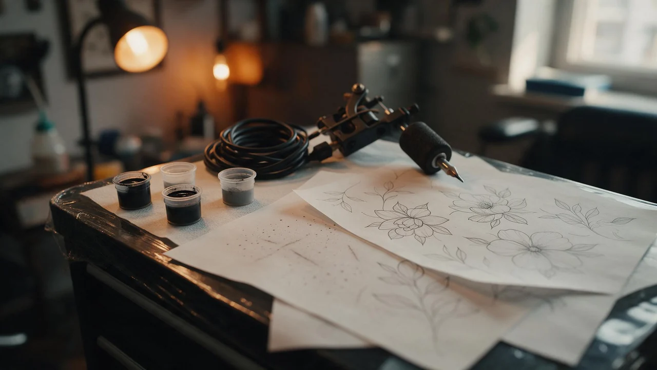
Ask ten people to describe someone they love and most of them will mention a detail before a feature: the freckles, the scar on the chin, the swallow tattooed behind one ear. Details are what turn a pleasant, generic face into a particular person. They are also the first thing an image model forgets between one picture and the next.
This guide sorts the skin details you can write into a prompt in Fellowi Images by how well they survive a set, from the most dependable to the least. Each comes with a sentence to borrow and a short verdict. Everything here is about adult, fictional characters you invented.
How the list is ordered
The rule underneath it is simple: the bigger and vaguer a detail, the better it holds; the smaller and more exact, the more it drifts. A model is good at a skin tone and a general impression. It is bad at keeping one mark in one spot, and worst at anything with a precise design. Plan a character around that, and make the fragile details the ones you check by eye.
1. Skin tone and texture
“Warm olive skin, visible pores and faint laugh lines, matte finish, natural daylight.”
Name a tone with a colour word and an undertone (warm, cool, olive, deep brown, pale and pink-toned) rather than a single adjective like “tanned”, which a model reads as sunburn one time and as a filter the next. Put the texture words in the same sentence, so the skin is described once, as one thing.
Holds: the tone, in almost every render with the same wording. Drifts: the finish, which slides towards gloss when the light changes.
2. Freckles
“Light freckles across the nose and cheeks, a few on the forehead, fading towards the jaw.”
Describe freckles as a density and an area, never a count. “Seven freckles” produces a random number of dots; “light freckles across the nose” produces a pattern that reads the same at a glance. Heavy freckles over the whole face tend to turn into a texture that looks printed on; light to moderate is the range that looks like skin. Freckles also follow the light: on a sunlit face they show, in dim light they nearly vanish. That is realistic, and worth knowing before you call a render wrong.
Holds: the overall impression. Drifts: the exact map, every time. Nobody notices if the impression is right.
3. A mole or beauty mark
“A small dark beauty mark just above the left corner of her lip.”
One mark, tied to a landmark: the corner of the lip, the outer end of the eyebrow, the side of the neck below the ear. A landmark gives the model a place to put it; “on her cheek” gives it a whole cheek to choose from. Do not add two or three, because they multiply, merge or wander. Expect the mark to switch sides now and then, since models mirror faces more readily than people do. A side swap is the most common reason a set with a beauty mark looks off, and the fix is a reroll, not a longer sentence.
Holds: that there is a mark, near the landmark. Drifts: left and right.
4. Scars
“A thin pale scar through his left eyebrow, running slightly diagonally, old and well healed.”
One scar, short, with a location, a direction and an age. “Old and well healed” matters: without it models lean towards a fresh wound, which changes the mood of the whole picture. A long scar across the face comes back a different length in each render, and several scars become a pattern of lines. A scar through an eyebrow or across the chin is a classic for a reason: the landmark holds it in place.
Holds: a scar near the landmark, and the healed look if you asked for it. Drifts: its length and exact angle.
5. Tattoos
“A small fine-line botanical tattoo on the inside of her right forearm, black ink, a single sprig of lavender.”
Three parts: a style word (fine-line, blackwork, traditional, watercolour), one subject, and a placement. Small and simple holds best. The forearm, the shoulder, the shoulder blade and the spot behind the ear are good places, because they are easy to see and easy to name. Large pieces drift the most: a full sleeve becomes a texture of ink that differs in every picture, and a back piece is redrawn from scratch each time.
Two things not to ask for. Lettering: a name, a date or a quote in a tattoo comes back misspelled, the same limit that applies to any text inside a generated image. And other people’s work: a brand logo, a famous artist’s flash design or a character from a franchise is not yours to put on skin.
Holds: the style, the rough subject and the placement. Drifts: the design itself, line by line.
Real skin, not airbrushed
Many first renders come back with skin like a plastic doll: no pores, no shine, no lines. Write against it directly: visible pores, natural skin texture, faint fine lines at the eyes, matte. On an adult face a line at the corner of the eye is not a flaw; it is what keeps a picture from looking like a filter. The studio’s prompt enhancer offers styles that may push towards a photographic look, but it rewrites your prompt and can smooth over the details you wrote, so compare a draft with and without it; letting AI rewrite your prompt weighs that trade.
Texture also depends on light. Flat frontal light hides it; light from the side, from a window at a low angle, brings out pores, freckles and the edge of a scar. The lighting recipes cover the setups.
One character, the same skin every time
For a set, write the character’s skin as one short line and paste it unchanged into every prompt: “warm olive skin, light freckles across the nose, a thin pale scar through the left eyebrow, a small fine-line lavender tattoo inside the right forearm”. Then attach your best picture of them as a reference image (the cheapest image family takes no references, so pick one that does). References carry details further than words, though not all the way. Keeping a character consistent explains the method in full, and hair and makeup covers the other half of a face.
The lines that do not move
Every character here is an adult and written as one, with an adult’s face: a line by the eye, a scar with a history, a tattoo someone chose. Do not lean on “smooth” or “flawless” skin to make someone look younger; that is the wrong direction for a set of adult characters. Words that make a character read as a minor, and any stated age under the legal age, are refused before a single coin moves, and minors, age-play and non-consent are refused whatever the wording. A distinctive tattoo is also an identifier: copying a real person’s tattoo, or a real face with its marks, makes a real person recognisable, and the terms forbid sexual or intimate imagery of any real, identifiable person. Invent the marks along with the character. What is legal and what is not has the fuller picture.
What it cannot do
It cannot copy a tattoo exactly from one picture to the next. References keep the style and the subject; the lines change, and a set where every tattoo matches line for line is not something to promise a client or yourself. It cannot write: no names, dates or words in ink. It cannot promise a mole on the same side, or the same freckles, in every render. A generation that fails is refunded; a finished picture with a wandering scar is not, so draft cheaply first, as drafting before you spend describes, and see the product page for what each render costs. When one detail matters more than the rest, choose the render where it is right and build the set around that one.
Questions this post answers
How do I keep the same tattoo across a set of AI images?
Write it the same way every time, as a style, one subject and a placement, and attach your best picture of the character as a reference image. The style and placement hold well; the exact lines vary a little, so small, simple designs work best.
Why does text in an AI tattoo come out wrong?
Lettering inside a generated image is unreliable, so names, dates and quotes come back misspelled or warped. Leave words out of the tattoo; if you need them, add them afterwards in an image editor.
How do I get AI freckles that look real?
Describe a density and an area, such as light freckles across the nose and cheeks, instead of a number, and ask for natural skin texture. Side light from a window shows them; flat frontal light hides them.
Keep reading
Body Types in NSFW AI Character Generation: Describing Real Adult Bodies
Leave the body unsaid and the model hands you the same one every time. Seven notes in the figure-drawing tradition: build, proportion, height, skin and the marks of an adult life.
NSFW AI Scenes and Settings: Dress the Room Before You Light It
Before the light, the outfit or the pose, there is a room. A set designer's walk through four dressed rooms, the props that earn their place, and the sentence that keeps a setting from drifting.
Colour Palettes for Adult AI Character Art: Grading Words That Set the Mood
Six palette cards a colourist would recognise, the words that trigger each, and why skin tone is the colour to protect first. A painter's swatch board, not a prompt dump.