

Colour Palettes for Adult AI Character Art: Grading Words That Set the Mood
By The Fellowi Team · · 7 min read
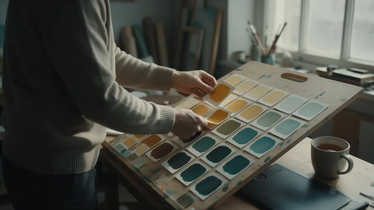
A colourist keeps a board of swatch cards: a strip of a finished grade, three or four chips beside it, a note on what the grade does and where it breaks. When a director says “make it feel like late summer”, the colourist does not argue about late summer. They pull a card.
Prompts for character images can work the same way. A palette is a handful of words, and the model treats them as a grade laid over everything in the frame. These are six cards for Fellowi Images, written for adult characters and kept, like the rest of this craft series, about colour rather than content. Light itself, where it comes from and how hard it falls, has its own guide in boudoir lighting; this board starts after the light is set.
Six palette cards
Each card has the words that call the grade up, what it does to the mood, and the place it usually breaks. Almost every break is on the skin.
Warm amber
Words:“warm amber colour grade”, “honey and ochre tones”, “warm white balance”, “golden palette”.
Mood: closeness, comfort, the feeling of a memory you like. It flatters wood, wool and linen, and it makes a room look lived in.
Where it breaks:the skin turns orange, then sallow, because the model warms everything by the same amount. Add “natural skin tones” to the grade, and leave one cool thing in the frame, a grey-blue wall or a white sheet, so the eye has something to measure the warmth against.
Teal and orange night
Words:“teal and orange colour grade”, “cool teal shadows, warm skin”, “cinematic night palette”.
Mood: tension and glamour, the look of a film poster. Warm skin sits against cold surroundings, so the face comes forward out of the frame.
Where it breaks:it is the most overused grade there is, and pushed hard it turns faces orange and the shadows on them green. Put “subtle” or “restrained” in front of it and the result looks like a film still rather than a trailer.
Muted film
Words:“muted colour palette”, “faded film look”, “lifted blacks”, “soft low-contrast colour”, “fine film grain”.
Mood: quiet, unhurried, honest; a Sunday with nowhere to be. It is the most forgiving grade for a series, because nothing in it shouts.
Where it breaks:muted drifts into grey and the skin goes ashen. “Faded” can also bring scratches and dust you never asked for. “Muted but warm” and “clean, no film damage” keep it on the right side.
High-key pastel
Words:“high-key pastel palette”, “blush pink, powder blue and mint”, “airy, bright, soft contrast”.
Mood: light, romantic, editorial; the colour of a spring fashion page.
Where it breaks:the brightness washes out the face, and the jawline and eyes lose their shape. Ask for “defined features” and keep one darker accent in the hair or the clothes.
A soft palette is a mood, never a reason to make a character read younger. Keep the adult in the prompt (a woman in her thirties, a grown man in a tailored shirt) and let the colour do the softening. Minor-coded words such as “little girl” and any stated age under eighteen are refused before any coin moves, and age-play and non-consent are refused the same way. The rules in full are in what the law and our terms allow.
Monochrome and duotone
Words:“black and white”, “high-contrast monochrome”, “silver gelatin print look”, “sepia”, “duotone in deep blue and rose”.
Mood: timeless, graphic, serious. With the colour gone, the eye reads shape, texture and expression, which is why it flatters a strong face.
Where it breaks:monochrome can come back flat and grey, so name the contrast: “deep blacks, bright highlights”. It sometimes leaves a stray tint behind. Duotone colours tend to fill the eyes and lips; that can be the point, or it can look like a filter accident.
Deep jewel tones
Words:“jewel-tone palette”, “emerald, sapphire, garnet and amethyst”, “rich saturated colour”, “velvet-dark shadows”.
Mood: luxury, evening, theatre; a room someone dressed up for.
Where it breaks:saturation spills. A green room tints the skin green, a purple one makes it look bruised. Put the jewels on things, not in the air: “an emerald velvet sofa, a garnet silk dress, warm natural skin”.
One accent, from across the wheel
The colourist's oldest trick is a single complementary accent: one thing in the colour opposite the grade. A teal room and a rust dress. An amber room and a blue glass on the table. A green jewel-tone set and a red lip. The accent tells the viewer where to look, and it keeps a strong grade from sliding into a monotone. One is enough; two accents compete, and three make a carnival. Clothing is the easiest place to put it, and the fabric guide has the words for how a colour sits on cloth. Hair and lip colour, in the hair and makeup notes, are the other place.
Protect the skin first
Viewers forgive a strange wall. They do not forgive strange skin. Skin is the one colour everyone has looked at all their lives, so a grade can move every other colour in the frame and the picture survives, but move the skin too far and it reads as ill, or as plastic.
Name the skin as its own colour, apart from the palette: “warm olive skin”, “deep brown skin with warm undertones”, “pale skin with pink undertones”, “freckled, sun-warmed skin”. Put it next to the person and the palette at the end of the prompt, so the model ties one to the character and the other to the frame. Darker skin in particular tends to lose its warmth and detail under a heavy cool or desaturated grade; if the grade is strong, write “rich, natural skin tones” outright.
Then give the palette somewhere to live: “the room in teal and slate, the dress in rust”. A colour attached to an object stays on that object more often than a colour that is only in the air. A whole card in use:
A woman in her thirties with deep brown skin and warm undertones, in a rust linen dress, reading on a slate-blue sofa, restrained teal and orange colour grade, natural skin tones, soft contrast.
Holding one palette across a set
Each render reads the prompt fresh, so a grade drifts from picture to picture unless you hold it. Write the palette as one fixed line (the grade word, three named colours, the contrast) and paste it unchanged into every prompt of the set. Change the pose and the scene around it, never the line.
Stay with one model family for the whole set: the same words render differently in each, and a set that switches halfway looks like the work of two photographers. Then attach your best picture as a reference image. References are known for holding a character, but they carry a look across a set just as well, and with the aspect ratio on Auto the frame follows the first one. Each reference adds to the price and the cheapest family takes none; the numbers are on the product page. Keeping the face itself is covered in keeping a character consistent.
Watch the scene words. “Sunset”, “neon street”, “forest” and “snow” each bring a palette of their own, and when the scene and the palette disagree, the scene often wins. Pick a scene that agrees with the grade, or name the grade twice. The art style moves colour too: oil paint and anime each have their own colour habits, covered in the art styles tour.
If you switch on Enhance prompt quality, read what comes back. It rewrites the prompt in full for a small extra charge, and a careful “muted but warm, lifted blacks” can turn into “vibrant colours” or vanish altogether. Whether the rewrite is worth it is its own question: should you let AI rewrite your prompt.
What a colour word cannot do
- Hit a hex code.“#1f4e57” in a prompt is not reliably followed. A named colour and a mood word get you closer than a number.
- Look the same on every model. The same palette line renders differently from one model family to the next, which is why a set stays on one.
- Look the same on every screen. A phone at full brightness and a laptop in night mode show one file as two pictures. Judge a set on one screen.
- Survive print. The output is not colour-managed or print-accurate; a print will not match the screen without a proofing step of its own.
- Stay out of the skin. Colour words bleed into skin and clothing. Every fix on this board reduces that; none removes it.
- Overrule the scene. When a scene word implies another palette, the model may ignore yours.
And sometimes our image-generation provider declines a picture as sensitive, whatever its colours. Failed generations refund their coins, and the reasons are in why AI image generators refuse. Start in Fellowi Images with one card and one accent, and once you like the result, hold the line.
Questions this post answers
Which colour palette words work best for AI character images?
Plain names of a grade and a few colours work better than codes: warm amber, teal and orange, muted film, high-key pastel, monochrome or jewel tones, plus three named colours. Add natural skin tones to whichever you choose, because the skin is where a palette most often goes wrong.
Why does my colour grade turn the character's skin orange or green?
Colour words tend to tint everything in the frame, skin included. Name the skin as its own colour, attach the palette to objects such as the walls and the clothes, and soften the grade with a word like restrained.
How do I keep the same colours across a set of pictures?
Paste one fixed palette line into every prompt, stay with one model family, and attach your best picture as a reference image. Scene words such as sunset bring their own colours, so choose scenes that agree with the palette.
Keep reading
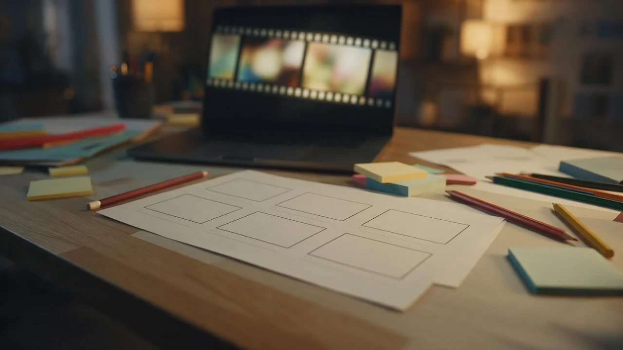
NSFW AI Image Series: Telling a Story Across Six Frames
One good picture is a moment. Six that belong together are a story. A shot list from establishing frame to quiet close, with the settings that keep it one character.
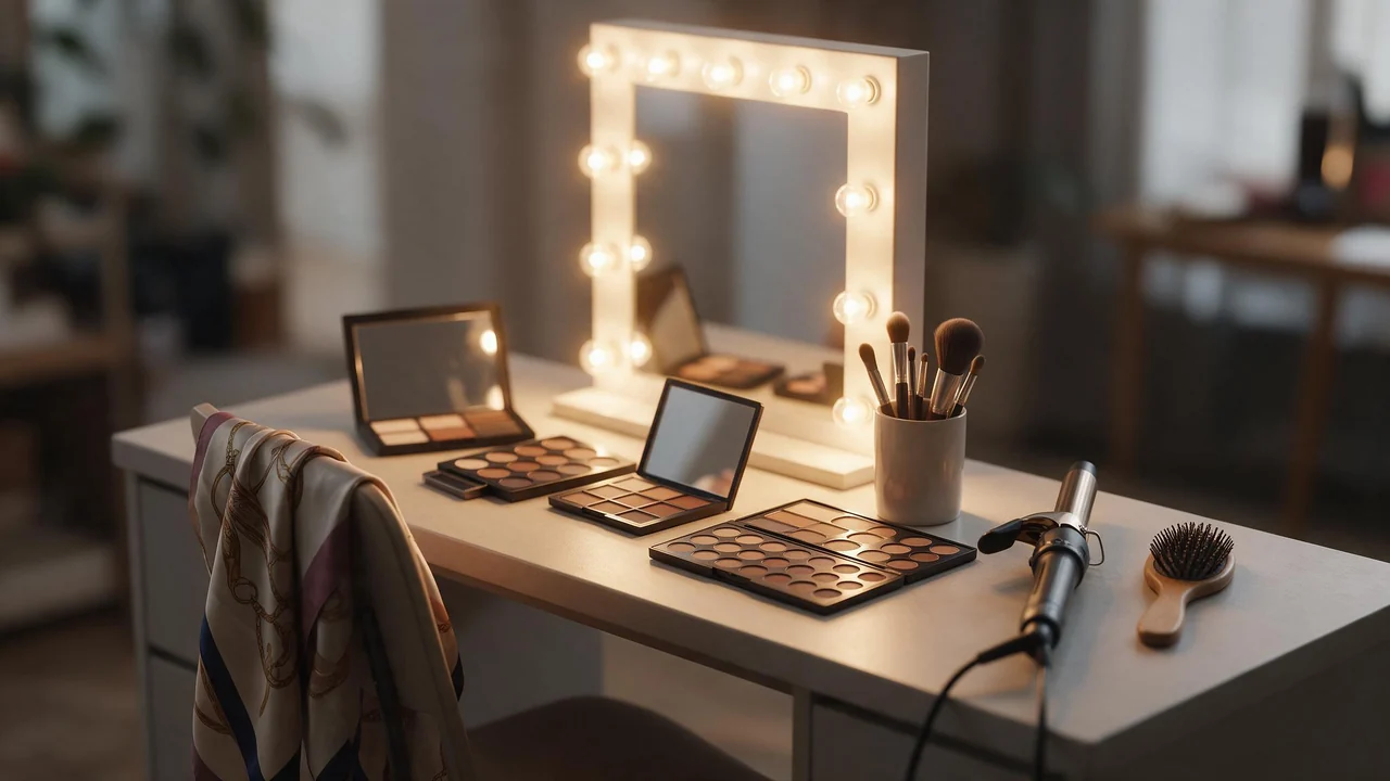
Hair and Makeup Prompts for NSFW AI Characters: Words That Render
A stylist works in order: hair, skin, eyes, lips, then a photo for continuity. The same order makes a better prompt. A prep sheet of the words that render and the ones that do nothing.

NSFW AI Art Styles: A Guided Tour from Photoreal to Pin-Up
Five looks for adult AI images, the vocabulary that moves a model toward each, one suggestive example prompt apiece, and how to keep a whole set in one style.