

Why AI Images Look Like AI, and the Words That Fix It
By The Fellowi Team · · 7 min read
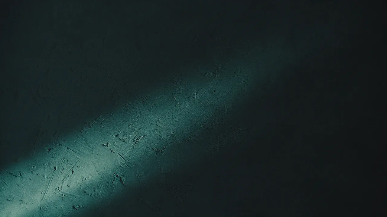
You can usually tell. Not because the picture is badly made, but because it is too well made: the skin has no pores, both sides of the face match, the light comes from nowhere in particular, and nothing in the background is scuffed. It reads as a photograph of a place that does not exist, which is exactly what it is.
The cause is simple enough to be useful. The model is aiming at the average of an enormous number of well-made photographs, and averaging away everything that varied. What varies between real photographs is the imperfection: a blemish here, a hard shadow there, a lens that is soft in one corner. Average all of that together and you get something smooth, symmetrical and dead.
Which means realism is not something you ask for. It is something you argue the model down into, one specific flaw at a time.
Five tells and the clause that answers each
Plastic skin.The default beauty pass. Every portrait dataset is full of retouched faces, so the average face has no pores at all. Ask for the texture back explicitly: “visible skin texture, fine pores, a few freckles across the nose, unretouched”. It feels strange to request imperfection, and it is the single biggest upgrade available to a generated face.
Symmetry.Real faces are not symmetrical and real rooms are not centred. The average of everything is, because the asymmetries cancel out. Break it on purpose: “head turned slightly, weight on one hip, the composition off-centre with more space on her left”.
Light from nowhere. The most common and the most fixable. If you do not say where the light comes from, the model splits the difference between every lighting setup at once, and the result has soft shadows in every direction, which happens nowhere in nature. One named source with one direction fixes it instantly.
Too-clean surroundings. Real rooms have a cable, a smudge, a coat over the back of a chair. Naming one piece of clutter does more for believability than another sentence about the subject, and it is one of the cheapest words you can spend.
Dead eyes.Harder, and worth knowing why: eyes read as alive because of the catchlight, the small bright reflection of whatever is lighting them. An averaged face gets an averaged, centred, symmetrical pair of catchlights, which is the look of a mannequin. Ask for one: “a single window catchlight in her eyes, slightly off to the left”.
Optical words that do something, and ones that do not
Camera vocabulary works when it names a physical consequence and does nothing when it just sounds professional. The difference is worth internalising because half the prompts people copy from each other are the second kind.
Earns its place: a focal length, because it changes how much of the background is in frame and how the face is compressed. An aperture, because it decides how much is sharp. Time of day. A named film stock or a colour cast, because it constrains the palette. Grain. A specific lens flaw, like vignetting or a soft corner.
Earns nothing:“8k”, “ultra detailed”, “masterpiece”, “award winning”, “professional photography”, “hyperrealistic”. These describe how you would like to feel about the result, and the model cannot draw an opinion. Worse, they occupy attention that a real clause could have used.
A useful test: could a photographer standing in the room act on this word? “35mm, shot from slightly below” is an instruction someone can follow. “Hyperrealistic” is not.
Name a real lighting situation
If you change one thing after reading this, make it this one. Not “good lighting”, not “cinematic lighting”, but a situation that could actually occur:
- “late afternoon sun through a west-facing window, long shadow across the floor”
- “overcast noon, flat soft light, no visible shadows”
- “one bedside lamp to her right, the rest of the room falling into dark”
- “street lamp overhead at night, hard shadows under the eyes, wet pavement reflecting it”
Each of those forces a direction, a hardness and a colour, and each rules out the everything-at-once look that makes an image read as generated. It is the same principle as the clause order in our paste-ready prompts: light is the clause people skip and the one that carries the most.
Resolution is not realism
High quality renders at a higher resolution, and that buys detail, not believability. It will draw plastic skin at 2K exactly as faithfully as at 1.5K, just with more pixels of it. Fix the prompt first at Standard for 40 coins, then re-run the version you like at High for 60 if you actually need the size. The full comparison is in the post on quality and formats.
Two other honest limits. Hands and faces are the hardest subjects, because every viewer is an expert on both and will catch an error they could not describe. And if you need the same face across several images, no amount of realism vocabulary will do it: that is a job for a reference image, as the post on character consistency explains. Words cannot carry a face.
Practise on surfaces before people. Fabric, worn metal, food, wet stone. They respond to exactly the same vocabulary, nobody is an expert on what a specific saucepan looks like, and you will learn what “hard light from the left” actually does far faster than you would on a portrait. Then take it to Fellowi Images and change one clause at a time. A failed generation returns your coins, so the only real cost of an experiment is a minute.