

Podcast Cover Art With AI: The Square That Has to Work at Thumbnail Size
By The Fellowi Team · · 6 min read
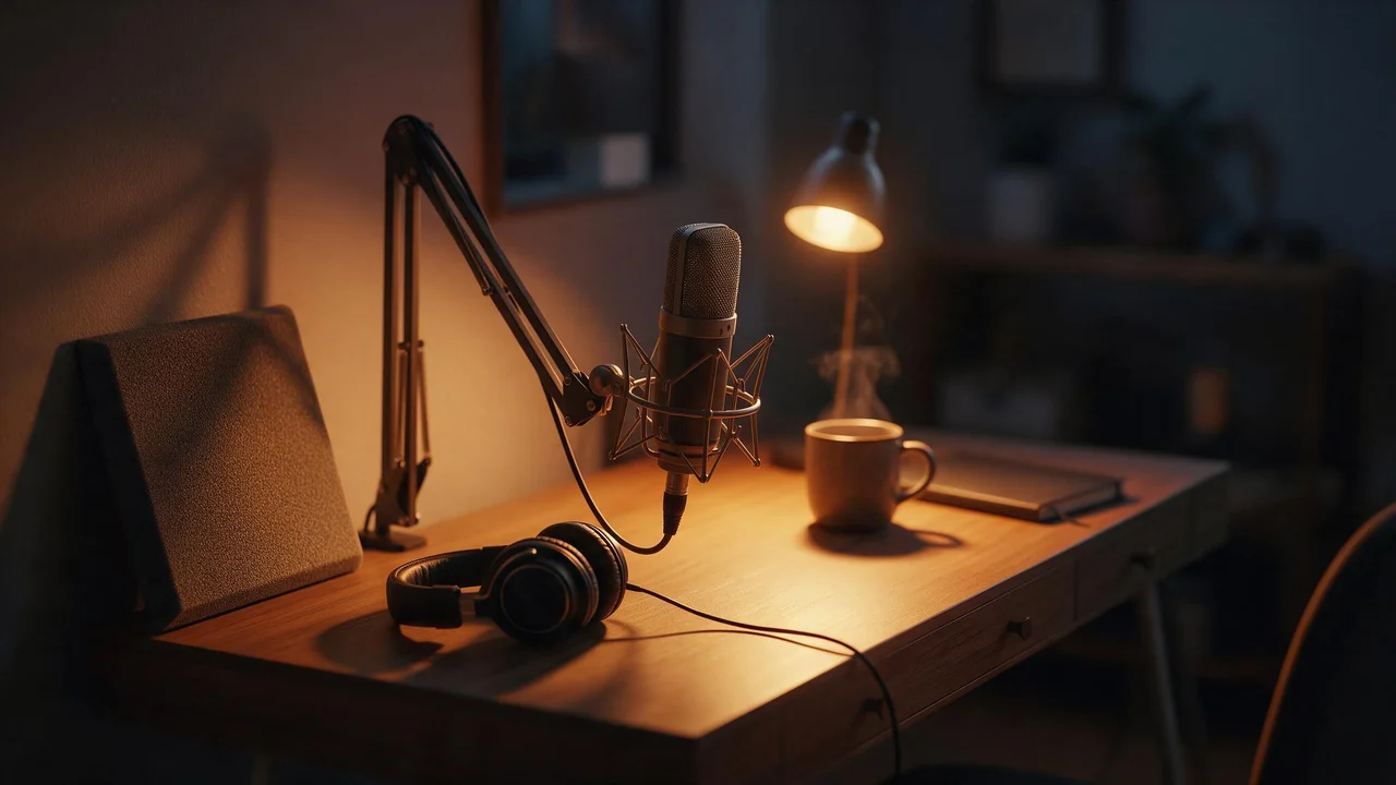
A podcast cover lives two lives. On your laptop it is a big, careful square you look at for an hour. Everywhere else it is a tile the size of a fingernail, in a scrolling grid of a hundred other shows, seen for half a second by someone who has never heard of you. Only the second life matters. Here are five drafts a small interview show made in Fellowi Images before it found a cover, what was wrong with each, and the rules they add up to. The show is a composite; the mistakes are the common ones.
Draft one: the whole show in one picture
The prompt tried to say everything: a microphone, a city skyline, two chairs, coffee, a bookshelf, sunset, “conversations about work and life”. The result was a handsome picture at full size and grey mush at thumbnail size. Shrink it to the size of a stamp and nothing survives except a vague warm blur.
The rule: one subject, large, with a clear edge against its background. Before you keep a cover, make it tiny and look again. If you cannot say what is in it from across the room, the grid will not either.
Draft two: the microphone
Version two fixed the clutter by showing a single studio microphone on a dark background. It read perfectly at any size. It also looked like the cover of every other podcast ever made, because the microphone is the one object every podcaster thinks of first.
The rule:pick the subject from what the show is about, not from how it is recorded. A show about work got much further with an object from work: a worn leather tool belt, an office chair turned towards a window, a lanyard hanging from a hook. Write it plainly: “a single paper coffee cup on a concrete ledge, early morning city light, strong shadow, plain background, centred, lots of empty space at the top”. The prompt guide has the method in more detail.
Draft three: a wide picture, cropped
The third draft was generated wide because wide looked better in the studio. Cropped into a square for the directory, it cut the cup in half. Regenerating in the right shape cost another round of coins.
The rule: choose the square aspect ratio before the first generation, not after the best one. If you also want a wide banner for your website or a tall image for stories, generate those separately in their own shapes rather than stretching the cover; which shape suits which place covers the rest.
Draft four: the title, written by the model
Draft four asked for the show's name on the cover. It came back with one letter doubled and another one invented. That is not bad luck: lettering inside a generated image is unreliable, and a typo on a cover is seen by every listener you will ever have.
The rule:ask for space, not words (“large empty area across the top third, no text”), then set the title yourself in any design tool. Choose one heavy, simple typeface, make the name as big as the space allows, and check it at thumbnail size too. Your type is also what stays the same when you change the picture next year.
Draft five: the one that shipped, and its episodes
The cover that shipped was the coffee cup: one object, a strong shadow, empty space for a name set by hand. The next question was episode art. Some shows give every episode its own square, and the trap there is that each one comes out in a new style, so the feed looks like ten different shows.
The rule:keep a short style line and paste it into every episode prompt unchanged (“single object on a concrete ledge, early morning light, strong shadow, muted palette”), change only the object, and attach the cover as a reference image so the light and colour carry over. Expect some drift between renders and keep the ones that sit together. Your style line is worth saving; keeping a prompt library explains how.
A cover that moves
For a trailer or a short clip on social media, the cover can become a few seconds of video: steam rising from the cup, the shadow sliding as the light changes. Fellowi Video animates a still image; give it the cover without the title and add the type on top in your editor afterwards, for the same reason as above. The difference between starting from a picture and from text is in text to video vs image to video.
What it cannot do
- It cannot design your brand. A generated picture is not a logo, and there is no exclusivity: another show writing a similar prompt can get a very similar cup. The name, the type and anything you want to register belong in your own design file, made or checked by a person.
- It cannot spell. Titles, guest names and episode numbers go on in a design tool.
- It cannot draw your guests.A portrait of a real, identifiable person needs that person's permission, and a generated face that looks like your guest but is not quite them is worse than no face. For a guest episode, use a photo they sent you.
- It cannot check the directory's rules for you. Shape, minimum size and file type are set by each directory and change from time to time. Read them, then check the pixel size of your download; the qualities on offer are listed on the product page.
- It cannot keep a series perfectly identical. References hold the look closely, not exactly. Small changes between episodes are normal.
Rights, and where to keep the files
Using a generated cover for a show that earns money is allowed: our terms place no restriction on commercial use, and the commercial use guide goes through the details. They do not give you a copyright warranty; why not is in who owns AI-generated images.
Generated files are kept for a limited time and then deleted (the current period is on the product page). Download the cover the day you choose it, keep the original without type next to your design file, and keep the prompt with it. The day you want a winter version, you will have everything you need to make one that still looks like your show.
Questions this post answers
Can I use an AI-generated image as my podcast cover?
Yes, our terms place no restriction on commercial use, so a cover for a show you monetise is fine. There is no copyright warranty and no exclusivity, so keep the image as artwork and build the show's name and logo in your own design file.
Can the AI put my podcast title on the cover?
Not reliably: letters inside a generated image often come out misspelled or warped. Generate the picture with empty space where the title goes, then set the title in a design tool where the spelling is yours.
Will the image meet the podcast directory's artwork requirements?
Check the directory's current rules for shape, minimum size and file type, then check the pixel size of your download against them. Generate in a square frame from the start, because cropping a wide picture into a square loses the subject.
Keep reading
AI Book Covers for Self-Published Authors: What to Generate and What to Leave to a Designer
The art can come from a prompt. The title, the spine and the genre signals still need a human eye. A practical split of the work for indie authors, with the rights spelled out.
Where AI Images Actually Fit in an Agency: Concepts and Decks, Not the Hero Shot
Twenty concepts before lunch is a real advantage. A faithful photograph of your client's product is not. Knowing the line is the whole skill.
You Can Sell What You Generate Here. Most Generators Do Not Let You.
No share, no credit, no separate commercial licence. And three honest limits that no generator can write away for you.